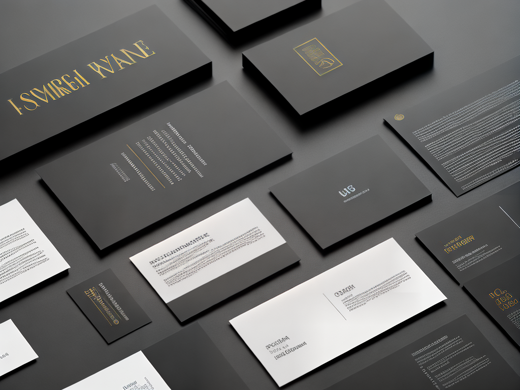


Typography is the art of visually expressing words. It’s what allows us to communicate with clarity and purpose in our designs. But beyond its practical uses, typography can be a powerful tool for conveying emotion and igniting creativity – if used correctly. In this article, we’ll explore how typography has the power to transform design projects into something truly special.
The right font choice can make or break a design project. It can bring life to an otherwise dull presentation, inject personality into corporate branding, or evoke strong emotions from viewers. With so much potential at our fingertips, it pays to understand the power of typography when approaching any creative endeavour. Let’s dive in!
The Basics Of Typography
Typography is a powerful tool in the design world. It sets the tone and mood of any project, from logos to websites to book covers. As such, it’s important for designers to understand its principles and best practices. In this section, we’ll explore the basics of typography – including font families, typefaces, point sizes and line spacing – so you can create designs with confidence.
Font families are groups that share a common visual style or theme. They typically include variations like italics or bolding which help make your text stand out on screen or paper while still looking consistent across different platforms. Typefaces are specific fonts within these families, like Helvetica Bold or Times New Roman Italicized, each with their own unique characteristics. Point size refers to the measurement of how large (or small) the text appears; usually ranging between 8-72 points depending on where it’s being used. Lastly, line spacing is how far apart lines of text appear from one another; too little space can cause words to run together making them difficult to read whereas too much will separate them creating an uncomfortable amount of white space around your content.
Understanding when and why certain typefaces should be used is essential for successful typographic design. When selecting a font family for a project consider both legibility at various sizes as well as if it properly expresses the message you want to convey through your work – does it look playful? Professional? Quirky? These questions can help guide you towards producing effective typographic solutions that deliver results every time!
With these fundamentals under our belt let’s move onto understanding fonts and typefaces further so we can begin crafting beautiful designs with ease!
Understanding Fonts And Typefaces
Typography is an important part of design, but it also has to be used correctly. While you can use any font and modify it to your liking, understanding the fundamentals of typography will help you make more informed decisions about what typeface or font works best for your project. Before we jump into choosing the right fonts for your design, let’s take a look at the basics of typography and how they can influence your design projects.
The first thing to understand is that there are two different kinds of typefaces: serifs and sans serifs. Serifs have small lines extending from the ends of letterforms which add emphasis to letters, while sans serifs do not have these extra lines. Both types offer their own advantages in terms of readability and aesthetic appeal so it’s important to consider both when making font choices. Additionally, some designers find it helpful to think about visual weight when selecting fonts – heavy weights tend to stand out more than lighter ones while light weights often blend better with other elements on the page.
Beyond just aesthetics, legibility is another key factor to consider when selecting typefaces. Different fonts present text differently, with some being easier to read than others depending on size and context. It may also be worth experimenting with various combinations of fonts as this could potentially lead to improved legibility in certain cases. Finally, remember that adjusting leading (line height) and tracking (character spacing) can also help improve readability if needed for longer pieces of copy or body text.
Before settling on a particular typeface or combination thereof, ask yourself whether the chosen style matches up with the overall tone of your project – does it feel modern? Is it friendly? Does it convey authority? The answers should provide guidance as you narrow down your choices until you find something perfect for your needs. Now let’s move onto exploring how understanding fonts and typefaces can further enhance our designs!
Choosing The Right Fonts
Choosing the right fonts for a design project can be daunting, but it’s well worth putting in the effort. A font is an important part of any visual identity, delivering both aesthetic pleasure and legibility. It must be carefully considered to ensure that the message being conveyed is done justice.
First things first: before you even start thinking about which font to use, the purpose of your project should have been established. Is this a corporate logo? A product label? Or something else entirely? Once you know what kind of impression you’re trying to make, then you can begin narrowing down choices.
From there, consider if the font will integrate with other elements used in your design such as colors or shapes; does it create contrast? Does its style fit within the mood of your overall message? Also think outside the box when it comes to type—you don’t always need to go for traditional serifs and sans serifs (although those are generally accepted standards). Contemporary typefaces provide unique visual interest that can really stand out from competitors.
Finally, make sure whatever font you choose looks good at all sizes and is easily recognizable across different devices—after all, people may encounter your designs on desktop computers, smartphones or tablets! With thoughtful consideration put into every aspect of selection, choosing just the right font becomes much less overwhelming and opens up possibilities for truly stunning visuals. The next step is exploring how best to ensure legibility and readability throughout your work.
Legibility And Readability
Legibility and readability are two important aspects of typography that designers need to consider when creating a design. Legibility refers to how easily the text can be seen, whether it is bold enough or if there is sufficient contrast between the font color and background. Readability speaks more to the actual content; does it flow smoothly? Are their words that could be replaced for simpler alternatives? Is the typeface appropriate for the subject matter?
Designers must also take into consideration factors such as kerning, tracking, leading and line length. Kerning adjusts space between individual letters, while tracking adjusts spacing across multiple characters at once. Leading increases vertical space between lines of text, making them easier to read. Lastly, line length ensures sentences don’t become too long so readers don’t lose track of what they’re reading.
Creating a visually appealing design isn’t just about choosing pretty fonts – legible and readable elements should always come first in any successful piece of work! Aiding your audience with these basic principles helps create an enjoyable experience no matter where or how they consume it.
It’s clear that taking time to understand common typographic principles can make all the difference when designing something meaningful and eye-catching. With this knowledge firmly planted in our minds, let’s explore how we can use typography to bring contrast into our designs.
Creating Contrast In Design
Symbols have the power to communicate something instantly, without words. They can provide a visual representation of an idea or concept and draw attention to certain elements that might otherwise be overlooked. Typography is no different; it holds immense potential as a tool for creating contrast in design.
The use of typefaces from opposing ends of the spectrum – such as sans-serif and serif – stands out immediately when placed side by side. Similarly, one could opt for fonts with wildly different characters sizes to create variation and attract interest. Contrasting colors are another great way to make typography stand out, even if they’re used subtly on small details like accent marks within text.
To truly master this craft, however, designers need to go beyond merely implementing contrasting aesthetics into their work. Using size, weight, style and color strategically while maintaining balance between all these elements is key in crafting powerful type solutions that will effectively guide users through any given website or application. It can also play a crucial role in conveying brand values and setting the tone for visuals throughout a project’s lifespan.
Typography has evolved significantly over time, but its importance remains unchanged: it plays a vital part in helping people understand content quickly and accurately – whether on paper or screen – making sure your message reaches its intended audience successfully. With carefully considered choices every step of the way, you’ll be able to take control of hierarchy levels within your designs and build relationships between different pieces of information effortlessly. Ready to level up? Let’s start crafting our own hierarchy of text!
Crafting A Hierarchy Of Text
Contrast in design is a powerful tool to emphasize the importance of certain elements and draw attention away from others. It can be used to create an engaging, eye-catching layout that stands out from competitors. Now that we’ve established how contrast works, let’s explore crafting a hierarchy of text to further refine the user experience.
Hierarchy adds emphasis to sections of content by controlling font sizes, weight and style within body copy or headlines. This allows readers to quickly comprehend which pieces are more important than others without having to read through all the details first. For example, using larger bolder fonts for section headings will indicate they should be noticed first while smaller fonts on regular body text would follow afterward.
Using different typefaces can also help achieve this goal as long as they complement each other well and make sense with the overall brand identity. Experimenting with italics, underlines or color can enhance the impact even further when done correctly but be careful not to overdo it since too much variation could become distracting instead of helpful.
With these techniques at your disposal you can easily craft a balanced visual structure that helps users navigate comfortably throughout your project’s message. From here we move onto emphasizing content with fonts—a great way to add personality and flare into any composition.
Emphasizing Content With Fonts
The power of typography in design is an art form that should never be overlooked. It’s the perfect way to bring creativity and innovation into any project – a brush stroke on canvas for the digital age, if you will. Just as a painter adds depth and dimension with their choice of colors, so too can a designer achieve similar results by carefully selecting appropriate fonts.
Emphasizing content with font selection is one of the most important decisions when it comes to graphic design. The right combination of typefaces can boost impactful messaging or establish a unique brand identity. Conversely, an ill-chosen font can undermine even the best laid plans; making text difficult to read or simply disrupting continuity within the piece itself.
That being said, there are some tried and true methods for ensuring success when using fonts in design projects: pairing complementary yet contrasting styles allows designers to create beautiful contrast while still maintaining consistency throughout; utilizing bolder versions of existing typefaces promotes visual hierarchy without sacrificing legibility; and experimenting with specific letterforms (like ligatures) provides subtle enhancements that enrich your work’s overall aesthetic appeal.
So whether you’re working on something lighthearted or more serious in nature, always remember that typography plays an essential role in conveying meaning through design – layer upon layer until the desired result has been achieved. With this knowledge firmly entrenched, let us now explore different typographical styles available today which have been carefully crafted to elevate visuals beyond just words alone…
Exploring Typography Styles
As you begin to explore the power of typography in design, it’s important to understand how fonts can be used to emphasize content. By employing various font styles and sizes, designers are able to draw attention to specific words or phrases within a piece. Additionally, by varying font weights and adding elements like drop-shadows and outlines, they can create contrast between different pieces of text.
Now that we’ve discussed emphasizing content with fonts, let’s take a look at exploring typography styles. There is an abundance of typefaces available today ranging from classic serifs to modern sans-serifs, script faces, slab serifs, blackletter designs, display faces and more. With so many options out there for designers, experimentation opens up limitless possibilities for creating unique looks for any project.
Whether designing for print or web environments, using just one typeface isn’t always enough. Combining typefaces is key when it comes to crafting great designs that make an impact. To ensure successful pairings between two (or more) fonts, consider the visual hierarchy components such as: xheight size ratio; stroke weight balance; letterfit; xwidth variations; counterform proportions; spacing characteristics; contrast levels & angles; and contextual usage rules.
Using these typographic principles as your guide will help avoid costly mistakes while also creating beautiful compositions that perform well across multiple platforms. Leveraging letterforms correctly will lead you down a path of creative exploration where you’re free to express your ideas in powerful ways through thoughtful design decisions – no matter what the media may be!
Leveraging Letterforms
The power of typography in design is undeniable. Take, for example, the iconic Coca-Cola logo—each letterform carefully crafted to create a memorable and recognizable mark that stands out from its competitors. Leveraging letterforms, designers can shape how their audience perceives an experience by:
- Instilling trust:
- Crafting unique fonts that evoke credibility and recognition
- Using hand drawn lettering to demonstrate sincerity and personalization
- Establishing authority:
- Utilizing bold typefaces to portray strength and confidence
- Incorporating modern serifs that signify knowledgeability and expertise
- Creating emotion:
- Implementing playful sans-serifs to convey playfulness and warmth
- Integrating script typefaces that reflect elegance and grace
When used thoughtfully, typography has immense potential to communicate meaning through visual cues alone. By manipulating letter forms in accordance with the message one wishes to impart, brands are able to quickly articulate desired emotions without relying on words or images. From inspiring confidence to eliciting joy, typography provides powerful tools for crafting meaningful experiences. With these pieces of evidence at our disposal, it becomes clear how essential leveraging letterforms is when building any successful brand identity. Now we can move onto exploring ways of using typography to convey emotion.
Using Typography To Convey Emotion
Typography is an important part of design. It can be used not only to convey information but also to evoke emotion and set the tone for a project. This power of typography should not be ignored when designing projects, as it has the potential to give them life and create memorable experiences.
When using typography to convey emotions, there are certain fonts that instantly evoke feelings such as joy or sadness depending on their style. For example, serif fonts express tradition and respectability while sans-serif fonts tend to have a more modern feel. Choosing the right font for each piece of design is critical in order to effectively transmit the intended message. Additionally, size plays an essential role in how effective text will be at conveying emotion. Smaller lettering implies something weak or insignificant whereas larger sizes indicate strength and importance.
Color is another factor that needs consideration when using typography for emotional expression. Warm colors like red or orange can make people excited, energized, and passionate; meanwhile cool blues or greens often bring forth feelings of trustworthiness and reliability. On top of this, contrasting those base hues with lighter shades can help emphasize specific points throughout a design project even further.
By making wise decisions about typeface selection, size range, color palette and readability—typographers can work wonders by imbuing designs with subtle yet powerful cues that drive desired responses from audiences without them consciously realizing it’s happening. With all these elements combined correctly designers are able to take ordinary words and turn them into engaging stories sure to captivate any audience they’re presented too – creating meaningful experiences worth remembering long after seeing them first time around. As we move forward let’s look closer at analyzing typography in popular designs today; exploring what makes some stand out over others so we may learn from them now for future success!
Analyzing Typography In Popular Designs
Poetic prose and powerful phrases, punctuating picturesque possibility with typography. Through text-based tools of transformation, typeface can tantalize the senses while creating captivating content:
- Designers use fonts to frame their ideas;
- Typefaces evoke emotion and influence how readers interpret information;
- Text formatting adjusts the reader’s attention.
Typography is both an artform and a science that requires designers to think critically about audience perception in order to achieve a desired effect. By understanding typographic principles, you can leverage your message for maximum impact. As we explore further into applying typography to projects, let’s consider how these design decisions manifest in popular designs around us today.
Applying Typography To Your Projects
Typography is an important part of any design project. It can be used to convey a message, create an atmosphere, and draw attention. Typography helps define the visual language that communicates with viewers in a powerful way. To achieve the desired effect, designers must understand how typography works within their projects and apply it accordingly.
When designing with type, consider the audience you’re trying to reach and the kind of impact you wish to make. Determine what tone your text should take – whether serious or light-hearted – as well as if it should be formal or informal depending on its purpose. Additionally, decide which font style best suits the material being presented and use appropriate sizing for optimal legibility.
The combinations of fonts and sizes are endless; so experiment until you find something that resonates with your concept and visually conveys your message. Be mindful of the strength of contrast between different typesetting choices for maximum readability. Also keep track of line spacing, tracking (letter spacing), kerning (spacing between pairs of letters) and leading (line spacing). Knowing when to utilize these elements will help ensure that all words are given due importance while maintaining balance throughout.
Now that we’ve discussed applying typography to our projects let’s look at ways we can refine our skills by exploring tips that’ll bring out the best in our designs.
Tips For Refining Your Typography Skills
“The pen is mightier than the sword,” a wise saying that aptly applies to typography in design. As designers, we wield the power of type to convey our message with clarity and impact. It’s an essential skill for any designer looking to make their projects stand out from the crowd.
In this section, let’s explore some tips on refining your typography skills so you can take your designs to the next level:
Choose Your Typefaces Carefully:
- To start, pick high-quality fonts that are appropriate for your project; consider different styles like serif or sans serif font families as well as fonts specifically designed for print or web use.
- Make sure they create the desired tone—whether it be playful and whimsical or professional and serious—and complement each other without compromising readability.
Understand Typographic Hierarchy:
- Mastering elements such as size, weight, color, alignment and spacing will help establish visual hierarchy within text blocks which makes content easier to scan and comprehend.
- Spend time experimenting with these details until everything looks balanced and unified.
Incorporate Visual Details:
- Adding flourishes like drop caps, ligatures, quotes marks or custom bullets can really bring life into a page while creating interesting patterns throughout copy blocks.
- These subtle touches give readers something special that sets apart your work from others’.
By investing in typography skills now, you’ll have all the tools necessary to elevate your future projects from ordinary to extraordinary!
Conclusion
I have learned a great deal about the power of typography in design. From understanding fonts and typefaces to creating contrast, using it to convey emotion, and analyzing popular designs, this article has been an eye-opening experience. Typography should be used thoughtfully and carefully when added to any project; its ability to capture attention or evoke powerful emotions is undeniable. With practice and dedication, I can refine my skills further so that each piece of work I create stands out with impactful typographic choices. After all, mastering typography means having the capability to captivate your audience with just one look – a feat worthy of admiration!


